Monday, 31 January 2011

Evidence of Assessment Criteria

To make this blog easier to navigate for assessment purposes, here is a copy of the OCR Media Studies assessment criteria with links to posts that evidence the level of acheivement.

Currently, the key to criteria is as follows: 

Red = still to be evidenced.
Orange = in the process of being evidenced.
Green = evidenced.

Any words or phrases in blue are links to posts or groups of posts that contain the relevant evidence.

Research & Planning : Level 4 : 16-20 marks

    Evaluation : Level 4 : 16-20 marks
    • There is excellent understanding of the forms and conventions used in the productions.
    • There is excellent understanding of the role and use of new media in various stages of the production.
    • There is excellent understanding of the combination of main product and ancillary texts.
    • There is excellent understanding of the significance of audience feedback.
    • There is excellent skill in choice of form in which to present the evaluation.
    • There is excellent ability to communicate.
    • There is excellent use of digital technology or ICT in the evaluation.

      Main Media Text : Film : Level 4 : 32-40 marks
      • holding a shot steady, where appropriate;
      • framing a shot, including and excluding elements as appropriate;
      • using a variety of shot distances as appropriate;
      • shooting material appropriate to the task set;
      • selecting mise-en-scène including colour, figure, lighting, objects and setting;
      • editing so that meaning is apparent to the viewer;
      • using varied shot transitions, captions and other effects selectively and appropriately;
      • using sound with images and editing appropriately for the task.
        Where a candidate has worked in a group, an excellent contribution to construction is evident.
         

        Subsidiary Media Task : Poster : Level 4 : 9-10 marks
          Where a candidate has worked in a group, an excellent contribution to construction is evident.


          Subsidiary Media Task : Magazine Review : Level 4 : 9-10 marks

          • using IT appropriately for the task set;
          • showing understanding of conventions of layout and page design;
          • showing awareness of the need for variety in fonts and text size;
          • accurate use of language and register;
          • appropriately integrating illustration and text;
          • framing a shot, including and excluding elements as appropriate;
          • using a variety of shot distances as appropriate;
          • shooting material appropriate to the task set;
          • selecting mise-en-scène including colour, figure, lighting, objects and setting;
          • manipulating photographs as appropriate to the context for presentation, including within text, within particular IT programmes, cropping and resizing.
            Where a candidate has worked in a group, an excellent contribution to construction is evident.

            Thursday, 27 January 2011

            Quantitative Audience Research

            In an earlier post, I mentioned that Tom and I would be creating and sending an online questionnaire for quantitative audience research. Now, that questionnaire has been constructed, and it contains all the questions we thought would provide us with answers and statistics which will prove useful in the final stages of production of our media texts. 


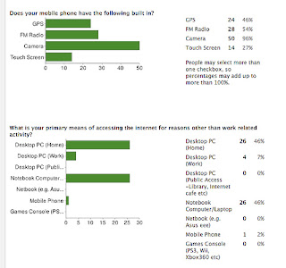
            To create the questionnaire, Tom and I used Google Forms, which was recommended by a friend. Google Docs is a free application that allows users to create, organise and store office documents online. The 'form' is just one type of document that Google Docs allows users to create and publish. For a free-to-use application, Google Forms looks extremely professional and is very easy to use. What's more, it automatically collects responses in a spreadsheet, and also organises them into individual graphs and charts for quick and easy interpretation, as shown in the example below. 


            The quantitative results won't change our texts enormously, because they are our creative ideas, and, naturally, we wish to see them through. What the results will do, however, is allow us to gear our texts towards the most receptive groups of people, ensuring that they reach as larger audience as possible. 


            Above is a screenshot of the post I added to the A2 Media Studies group on Facebook, asking people politely to take some time to fill out the questionnaire, and below is a screenshot showing the look and format of the questionnaire. 


            Click here to go to the questionnaire. 

            When Tom and I think we have enough results, I will close the questionnaire to responses and analyse the results. 

            Saturday, 22 January 2011

            Filming has commenced!

            Yes, that's right, the filming of our short film has officially begun! 

            Yesterday, we filmed a single shot from Scene 2 (information on the content of this scene can be found in the treatment and the animatic). Normally, we would have never considered shooting one shot of a one-minute scene on a separate day to the rest, but we thought that this single shot - of our protagonist walking out onto the school field as other students walk in - would prove difficult to film, so we wanted to start trying to capture this shot as soon as possible. 

            Luckily, it all seemed to go well, and we have a useable piece of footage, exactly how we wanted it. Thanks to a friend's tripod, the camera does not shake, thanks to common decency (or perhaps general ignorance), no kids waved at or stared into the camera at an important point, and thanks to our actor's willing and patient nature, we have a piece of footage that will have relevance and make sense. 

            The main disadvantage of filming the same scene across different days is that of consistency and continuity. Because the footage we have shot was taken on an overcast and windy day, the rest of the footage will have to be shot on a similar day. Either that, or we will have to re-shoot the 'walking out onto the field' shot when we shoot the rest of the scene, and just hope everything goes well again. 


            Either way, I am glad the filming process is underway. So glad, in fact, that I quickly knocked together this teaser trailer, which I hope will give people an insight into the sort of the film Tom an I are aiming to produce.

            Friday, 21 January 2011

            Production Log 4

            In this, our fourth Production Log, we explain what final preparations we are making before filming, and what audience research we are carrying out to help in the production of our ancillary products: a film magazine review page featuring our film, and a poster for our film.


            Thursday, 20 January 2011

            Short Film Title: PENUMBRA

            Yesterday, Tom and I recorded our latest Production Log, giving a general progress update and explaining our current situation. Unfortunately, yesterday evening, I realised that I had forgot to mention something relatively crucial: we have a title for our film!

            Tom and I have been thinking about various title ideas for a while. 'Selfless' was a strong candidate, as this is the central concept that our film revolves around. However, both Tom and I thought that this was too obvious; too 'in your face,' for a film that we intend to have a great degree of subtlety.


            One media lesson, we were trying to think of a title by explaining the plot of our film to people in different ways. We were focusing on the fact that the protagonist is doing good deeds; affecting other's lives for the better, without being noticed. A friend mentioned 'shadow' as a possibility, and whilst I liked the idea, I did not like the word 'shadow' itself. So later, I searched the internet for any interesting words related to 'shade' or 'shadow' that stood out. This is when I came across Penumbra, a title that Tom and I both liked.

            Penumbra is a suitable title, not only because it is an interesting word to say and pronounce, but because it carries a meaning which is relevant to our film and adds to the meaning of the film. 

            The word is used in many different contexts, each use with its own definition. The definitions that are relevant to us, from Dictionary.com, are as follows:

            General definition: a shadowy, indefinite, or marginal area.

            Legal definition: an area within which distinction or resolution is difficult or uncertain.

            Tom and I are looking to exploit the 'two-step flow' model in the marketing of our film (where discussions about the film become a way of advertising - Click here for Tom's explanation), and we are confident that Penumbra will draw people's interest, whether they hear it spoken in a face-to-face conversation, or see it written on the internet or in print.


            Above is a very short example of how the title could look at the beginning of the film.

            Thursday, 13 January 2011

            Plans For Poster & Magazine Review Page

            Whilst Tom has been working on posts relating to Target Audience and Editing Techniques, and I have been finishing the Animatic and looking at issues of Representation, we have also been discussing ideas for our ancillary products; a poster for our short film, and a magazine review page featuring our film. Here are some of the basic layout designs I have drawn, along with explanatory notes.


            Our film is about a person acting selflessly; a person who has an effect on others, but is not noticed or recognised by them, so I thought it would be good to convey this kind of message in the poster. My idea, as shown above, was to have a simple, geometric collage of many ordinary portrait shots, with the subject in each staring directly into the camera. They would all be around the same age as the protagonist, just as the characters in the film are, and the portraits would all be taken with a bright, airy background so that the person's outline stands out. Just beneath and to the right of the film's title (which we have yet to decide on), however, one of the photos will contain the same kind of blurred background as all of the other photos, but will not contain a subject. The appeal of this poster would firstly be in the stare of the subjects captured in the portraits; hopefully, this will unnerve people enough to look more closely at the poster and discover what it is advertising. The missing subject in one of the portraits will also hopefully add a sense of intrigue, so that the consumer remains curious about the film and its premise for a long time after seeing the poster.

            Below is another layout design suggested by Tom on the basis of the first. The core idea of the missing subject is retained, but the setting of the school/college is conveyed with the portraits being printed on a yearbook, and the yearbook being laid upon a desk. I like this idea, but I am aware that this poster will be considerably more difficult to create.


            In preparation for the magazine review page, I have been browsing through various film and cinema magazines, both in physical form and online. Although there are quite a number of magazines that allow consumers to view short films either online or via a DVD, there are surprisingly few that regularly offer actual reviews of short films. Therefore, our magazine review page will have to look like a special feature within that specific issue of the magazine, or like a first-time introduction to a new section of the magazine.

            Film magazines such as Empire and Total Film generally contain one or two large reviews that span two or three pages each, for popular or critically anticipated films, and these are followed by smaller reviews: a few that take up a single page each (for films that are less critically anticipated, but still popular), more that take up half a page (for semi-popular films), and even more that take up around an eighth of a page (for any other films). To keep the reader interested, these different sized reviews are combined on the page, but with the general trend being from pages covered in long reviews with large images, down to pages filled with small reviews with a single, small images. 


            Tom and I have decided that our review should be either the small 'eighth of a page' or medium 'half a page' size, within a page featuring other short-film reviews. Above is a basic sketch of what the page could look like.

            Thursday, 6 January 2011

            Test Footage

            Here, uploaded and edited by Tom, is the test footage we filmed with our main actor back in December. We performed the test, covering the entire first scene, so that we could confirm our choice of actor, and also generally so that we can tell if the film, with the shots and cuts we intend to use, is going to work.

            Here is the unedited footage in its entirety: 


            And here is the footage edited similarly to how we hope it will be in the final cut: