Here are a few recordings of interviews that were held to get some qualitative feedback on our Poster and Magazine Review Page. As with one of the Short Film feedback sessions, we interviewed media students and a media teacher, so that we would get a more detailed analysis of our work.
Tom has only been able to upload three of the six recordings due to technical error.
Unlike our Short Film, which wasn't received brilliantly, both of our ancillary products were very well received. In summary, people thought highly of the verisimilitude of the review and the authenticity of the poster, and agreed that both would fulfill their purposes well.
An in-depth explanation of what we learned from all of our feedback can be found here in my Evaluation Prezi.
Showing posts with label Ancillary Tasks. Show all posts
Showing posts with label Ancillary Tasks. Show all posts
Thursday, 24 March 2011

Wednesday, 23 March 2011
Evaluation
I have produced the Evaluation of my A2 practical production in the form of a Prezi presentation. The Prezi can be viewed embedded below in this post, but I would recommend that you view it on the official site by clicking below:
Click Here To View Prezi
Click Here To View Prezi
Final Products
They've been a long time in the making, but here they finally are; our finished Short Film, together with our completed Magazine Review Page and Poster!
Magazine Review Page
Poster

Short Film
Magazine Review Page

Tuesday, 8 March 2011
Writing Reviews
A while ago, I created a potential layout for our subsidiary task of a magazine review page, but since then, using the results of our audience research and having analysed some professional film reviews, Tom has developed a much better looking layout.
The full details of the review-page construction are here in Tom's post.
Just as I took the lead in the creation of our poster, with Tom contributing to the design, Tom is constructing our review page, and I am contributing two small reviews of short films to go alongside Tom's larger review of our own film.
Below are my two reviews in their original states. Whilst writing them, I kept the results of our audience questionnaire in mind, which showed that, in the text of the review, readers wanted...
* Comparisons to other films.
* An unbiased perspective.
Although I didn't crop in direct comparisons to other films, I tried to acheive the same effect by making it clear what kind of genre the films fit into to, what kind of style they are, and who is likely to enjoy them.
For the unbiased perspective, I simply made sure I wrote about the films fairly, justifying every qualitative judgment I made.
Connected
For directors of shorts, filmmaking is always a careful of balancing of ambition against capability, and in Connected, Danish directors Jens Raunkjær Christensenand and Jonas Drotner Mouritsen strike the balance perfectly.
Described by Christensenand and Mouritsen as ‘a sci-fi western,’ Connected transports audiences to a desolate, post-apocalyptic wasteland, where it gives a glimpse into the torturous lives of the surviving few. Clearly a sci-fi by setting alone, Connected affirms its ‘western’ status with the conventionally confrontational characters that trudge through it, shot in the trademark style and accompanied by a soundtrack that even Ennio Morricone would be proud of.
What prevents Connected from being just another weird experiment in contemporary filmmaking, however, is also what makes it unique. There isn’t one part of Christensenand and Mouritsen’s film that doesn’t beg for you attention and contemplation; not one part that fails to make you think. In their brutal world, created from a neat combination of live-footage and CGI, the young directors reveal the startling literality of the film’s enigmatic title, as well as posing questions about the ethics of survival. It is testimony to the directors’ vision that Connected combines tense action and philosophic diversion in a way that many features struggle to imitate.
***** Five stars.
Floor Show
Going by name alone, any viewer would be forgiven for letting Floor Show pass them by, but names can be deceiving, and this is certainly the case with Sam Webber’s directorial debut.
Contrary to the simplicity of its title, Floor Show is a fascinating short that is as exuberant in style as it is disturbing in its themes. With murder, lust, and human salacity all featuring within the space of five minutes, the film will leave you feeling a little dirty, but also somewhat enlightened. The plot isn’t exactly original, but the brilliantly acted characters, atmospheric lighting and creative costume designs bring a welcome dose of drama to the quintessentially theatrical setting: an old-fashioned stage framed with blood-red curtains.
Webber is nothing if not a perfectionist; every shot and angle has been chosen with care, and each plays its own important part in the visual feast-for-the-eyes. Some audiences might find the extravagance off-putting, but Floor Show is sure to gain a substantial cult following from the art-house crowd, who aren’t afraid to value style as much as substance.
**** Four stars.
Unfortunately, I had massively overestimated the space available for the smaller two reviews, taking into consideration not only just the size of the page, but the space taken up by the details for the films and images from the films. After discussing the layout possibilities again and again with Tom, we decided that my two reviews really needed to be cut to around 60 words each; they would be more of a summary-review rather than a review itself.
Below are the final 'summary-reviews'. It was certainly difficult to cut them down to only a few sentences each, but I think I have succeeded in keeping them as informative and interesting to read as they could be at this length.
Connected
For directors of shorts, filmmaking is always a careful of balancing of ambition against capability, and in Connected, Danish directors Christensenand and Mouritsen strike the balance perfectly. Described as ‘a sci-fi western’, and set in a brutal post-apocalyptic wasteland, Connected is an artistic, intense and engrossing piece of film that is as sharp in concept as in execution.
***** Five stars.
Floor Show
Contrary to the simplicity of its title, Floor Show is a fascinating short that is as exuberant in style as it is disturbing in its themes. Webber is nothing if not a perfectionist, and every shot plays its part in the visual feast-for-the-eyes. Some audiences might find the extravagance off-putting, but Floor Show is sure to gain a substantial cult following from the art-house crowd, who aren’t afraid to place style ahead of substance.
**** Four stars.
In today's Media lesson, as I continued with some editing of our footage, Tom added these reviews to the page, and we tested a number of fonts to get the best likeness to the actual font used for the main reviews in the real Empire magazine. I also had a chance to look through Tom's review, so that I could point out any errors or typos he hadn't noticed.
Thursday, 3 February 2011
Poster Production
As can be seen in my plans, the original ideas Tom and I had for the poster revolved around a 'school yearbook' kind of look; either with faces of students simply staring out of the poster, or with faces staring out of the photos within an actual yearbook laid upon a desk. The central concept was in showing the absence of a person by having one photo that doesn't contain a subject; one photo that shows the background alone, with no face. The purpose of this was to convey the predicament of our protagonist; he is always around, putting others before himself, but never receives any recognition or praise; he goes pretty much entirely unnoticed.
Whilst Tom liked the plan including the actual yearbook, I kept pushing the first plan, because, not only was the grid of photos clearly going to be simpler, I believed it would be more effective; the faces staring directly out were going to catch people's eyes and draw their attention straight to our film. So, with this in mind, Tom and I used part of Tuesday's lesson to take volunteers into the library and photograph their head and shoulders against the quintessential school photo backdrop: a bookshelf. Pleased with the amount of photos we had taken, I went home, slipped the SD card into my laptop, and started editing away with photoshop.
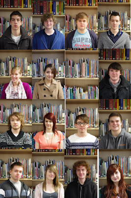
All of the volunteers couldn't have been more helpful, and I want to make clear that the abandoning of this idea is no fault of theirs. The problem is, it just doesn't look like a poster. Good posters jump out, grab your attention, and refuse to leave your mind until you walk into that cinema and purchase that ticket. What you see above is banal and bland; more effective as a sedative than a stimulant. Our quantitative audience research revealed that what audiences most looked for in a poster was an eye-catching image and images of the characters or actors. So, not only was this poster not performing its general role, it was not performing the specific roles required for it to appeal to our target audience.
Being entirely unhappy with this design (as you can probably tell), I went away thinking deeply about new possiblities and variations, keeping in mind the criteria set by our by our audience research results. I began to reconsider what it was that stood out to me most about our film. The predicament of the protagonist is definitely at the core of our film, but this is difficult to convey in a single poster, and besides, our target audience would be more interested in watching the film if they were yet to discover the nature of the protagonist's situation. Finally, it occurred to me: what gives the film its identity on first impression is the title - PENUMBRA (click here for an explanation).
So, last night, with the title of the film at the forefront of my mind, I began to construct an entirely new poster. I explained the idea over the phone to Tom, and from this he drew his own mock-ups of how the poster could look. The first two images below show the initial experiments carried out in photoshop yesterday evening, and the rest are all from different stage in the poster's production today. Below each image is an explanatory caption.
Because I have literally just completed this poster this afternoon, Tom has yet to see it, and I have yet to ask anyone besides my parents for feedback on it. Therefore, this is by no means our final poster. Before we reach that stage, I will look at the poster with Tom to see what variations we can create - perhaps of a different style, or perhaps in the same style for different modes of exhibition - and we will show the poster to a lot more people in order to get some detailed qualitative feedback.
Whilst Tom liked the plan including the actual yearbook, I kept pushing the first plan, because, not only was the grid of photos clearly going to be simpler, I believed it would be more effective; the faces staring directly out were going to catch people's eyes and draw their attention straight to our film. So, with this in mind, Tom and I used part of Tuesday's lesson to take volunteers into the library and photograph their head and shoulders against the quintessential school photo backdrop: a bookshelf. Pleased with the amount of photos we had taken, I went home, slipped the SD card into my laptop, and started editing away with photoshop.
I placed all of the photographs onto the canvas in order to get an idea of what the final poster was going to look like. That's when it dawned on me: THIS LOOKS REALLY AWFUL.

All of the volunteers couldn't have been more helpful, and I want to make clear that the abandoning of this idea is no fault of theirs. The problem is, it just doesn't look like a poster. Good posters jump out, grab your attention, and refuse to leave your mind until you walk into that cinema and purchase that ticket. What you see above is banal and bland; more effective as a sedative than a stimulant. Our quantitative audience research revealed that what audiences most looked for in a poster was an eye-catching image and images of the characters or actors. So, not only was this poster not performing its general role, it was not performing the specific roles required for it to appeal to our target audience.
Being entirely unhappy with this design (as you can probably tell), I went away thinking deeply about new possiblities and variations, keeping in mind the criteria set by our by our audience research results. I began to reconsider what it was that stood out to me most about our film. The predicament of the protagonist is definitely at the core of our film, but this is difficult to convey in a single poster, and besides, our target audience would be more interested in watching the film if they were yet to discover the nature of the protagonist's situation. Finally, it occurred to me: what gives the film its identity on first impression is the title - PENUMBRA (click here for an explanation).
So, last night, with the title of the film at the forefront of my mind, I began to construct an entirely new poster. I explained the idea over the phone to Tom, and from this he drew his own mock-ups of how the poster could look. The first two images below show the initial experiments carried out in photoshop yesterday evening, and the rest are all from different stage in the poster's production today. Below each image is an explanatory caption.
 |
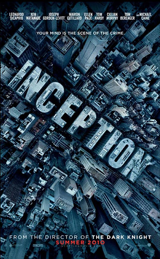
| Inspired by this poster for Inception, I put the title at an angle spanning most of the poster, and gave it the signature glow of our title (important because A- it looks cool, and B- it relates to the definition of penumbra as a part of a shadow). Then, using internet tutorials, I learned how to mask layers in such a way that images can appear within text. Our lead-actors eyes can be seen peering out from the forth stroke of the M. |
 |
| Here, I was trying to see if it was possible to have an image show through more than one piece of text. Luckily, this process wasn't as difficult as I had expected. |
 |
| This morning, in Media, the first thing I did was to create lots of text layers which i then transfromed and arranged to make an interesting collage. |
 |
| I then grouped the text layers appropriately, then rasterized them and merged them so that different images (either from our film or relating to it) can be seen in different peices of text. |
 |
| Deciding the images within the text were too busy with detailed colour, I made them all black and white, and this definitely had a positive effect in drawing more attention to the title. After discussing things with Tom, we decided it would be a good idea to have an outline of our protagonist in the bottom right-hand corner. I set about cutting a blurred image of our lead-actor out of a frame from our film, and once this was in the poster, both Tom and I agreed it looked better in full colour than as an outline alone. |
 |
| Next, in an attempt to make the poster stand out more, I experimented with different hues of different intensity for the images in the text. Eventually, I decided that red was most attention grabbing, and most fitting for the theme of pain which is important in our film. |
 |
| Finally, here (at full resolution, provided you click on the image) is our new poster! In this final stage, I increased the vibrancy and brightness of the colours in the image of our protagonist from the back, so that he is more visible against the solid black background. I also added some text (in the same font as the title for conguity) to specify that the poster is advertising a short film, and some other text to credit Tom and I as directors. (For the crediting font, I searched online to find fonts similar to those used for crediting in actual film posters, and then downloaded and installed one called 'Rothman' from this website) |
Thursday, 13 January 2011
Plans For Poster & Magazine Review Page
Whilst Tom has been working on posts relating to Target Audience and Editing Techniques, and I have been finishing the Animatic and looking at issues of Representation, we have also been discussing ideas for our ancillary products; a poster for our short film, and a magazine review page featuring our film. Here are some of the basic layout designs I have drawn, along with explanatory notes.

Our film is about a person acting selflessly; a person who has an effect on others, but is not noticed or recognised by them, so I thought it would be good to convey this kind of message in the poster. My idea, as shown above, was to have a simple, geometric collage of many ordinary portrait shots, with the subject in each staring directly into the camera. They would all be around the same age as the protagonist, just as the characters in the film are, and the portraits would all be taken with a bright, airy background so that the person's outline stands out. Just beneath and to the right of the film's title (which we have yet to decide on), however, one of the photos will contain the same kind of blurred background as all of the other photos, but will not contain a subject. The appeal of this poster would firstly be in the stare of the subjects captured in the portraits; hopefully, this will unnerve people enough to look more closely at the poster and discover what it is advertising. The missing subject in one of the portraits will also hopefully add a sense of intrigue, so that the consumer remains curious about the film and its premise for a long time after seeing the poster.
Below is another layout design suggested by Tom on the basis of the first. The core idea of the missing subject is retained, but the setting of the school/college is conveyed with the portraits being printed on a yearbook, and the yearbook being laid upon a desk. I like this idea, but I am aware that this poster will be considerably more difficult to create.

In preparation for the magazine review page, I have been browsing through various film and cinema magazines, both in physical form and online. Although there are quite a number of magazines that allow consumers to view short films either online or via a DVD, there are surprisingly few that regularly offer actual reviews of short films. Therefore, our magazine review page will have to look like a special feature within that specific issue of the magazine, or like a first-time introduction to a new section of the magazine.
Film magazines such as Empire and Total Film generally contain one or two large reviews that span two or three pages each, for popular or critically anticipated films, and these are followed by smaller reviews: a few that take up a single page each (for films that are less critically anticipated, but still popular), more that take up half a page (for semi-popular films), and even more that take up around an eighth of a page (for any other films). To keep the reader interested, these different sized reviews are combined on the page, but with the general trend being from pages covered in long reviews with large images, down to pages filled with small reviews with a single, small images.

Tom and I have decided that our review should be either the small 'eighth of a page' or medium 'half a page' size, within a page featuring other short-film reviews. Above is a basic sketch of what the page could look like.

Our film is about a person acting selflessly; a person who has an effect on others, but is not noticed or recognised by them, so I thought it would be good to convey this kind of message in the poster. My idea, as shown above, was to have a simple, geometric collage of many ordinary portrait shots, with the subject in each staring directly into the camera. They would all be around the same age as the protagonist, just as the characters in the film are, and the portraits would all be taken with a bright, airy background so that the person's outline stands out. Just beneath and to the right of the film's title (which we have yet to decide on), however, one of the photos will contain the same kind of blurred background as all of the other photos, but will not contain a subject. The appeal of this poster would firstly be in the stare of the subjects captured in the portraits; hopefully, this will unnerve people enough to look more closely at the poster and discover what it is advertising. The missing subject in one of the portraits will also hopefully add a sense of intrigue, so that the consumer remains curious about the film and its premise for a long time after seeing the poster.
Below is another layout design suggested by Tom on the basis of the first. The core idea of the missing subject is retained, but the setting of the school/college is conveyed with the portraits being printed on a yearbook, and the yearbook being laid upon a desk. I like this idea, but I am aware that this poster will be considerably more difficult to create.

In preparation for the magazine review page, I have been browsing through various film and cinema magazines, both in physical form and online. Although there are quite a number of magazines that allow consumers to view short films either online or via a DVD, there are surprisingly few that regularly offer actual reviews of short films. Therefore, our magazine review page will have to look like a special feature within that specific issue of the magazine, or like a first-time introduction to a new section of the magazine.
Film magazines such as Empire and Total Film generally contain one or two large reviews that span two or three pages each, for popular or critically anticipated films, and these are followed by smaller reviews: a few that take up a single page each (for films that are less critically anticipated, but still popular), more that take up half a page (for semi-popular films), and even more that take up around an eighth of a page (for any other films). To keep the reader interested, these different sized reviews are combined on the page, but with the general trend being from pages covered in long reviews with large images, down to pages filled with small reviews with a single, small images.

Tom and I have decided that our review should be either the small 'eighth of a page' or medium 'half a page' size, within a page featuring other short-film reviews. Above is a basic sketch of what the page could look like.
Friday, 5 November 2010
Poster for a Short Film: Semiotics

For me, the first logical step is to ask: What is a poster? (i.e., What are its constituents, and what is its purpose?) Well, in answer, a poster is a placard or bill intended for display in a public place for the purposes of advertising. To fulfill this purpose, posters usually contain information about a particular event or product, and they present this information in an appealing or interesting way, so that people who view the poster will be encouraged to attend the event or purchase the product.
- Semiotics is basically an area of study looking at signs as a means of communication.
- Signs are made up of two elements, the Signifier and the Signified;
- The Signifier is the material of which the sign is composed (text, images, sounds, etc)
- The Signified is the concept that the Signifier alludes to.
- The links between Signifiers and the Signified are culturally relative. (i.e., identical Signifiers may may allude to different concepts in different cultures)
In the same post, I concluded that, 'The media industry use signs because they are an efficient way of expressing a large amount of information with very little material.' Although I was writing with regard to mise-en-scene and cinematographic style at the time, it has since occurred to me that the same is true of any kind of advertisement, including posters.
Whilst it would be unnecesary to delve deep into the rabbit-hole of aggregatory academia that calls itself 'semiotics,' I am sure that an understanding of the importance of semiotics will result in a more structured and rigorous approach to our poster's production. There are three distinct branches of semiotics, and each is relevant to a different aspect of our poster:
Semantics


Syntactics
This branch deals with the formal or structural relationships between signs. In order to create a film poster that does its intended job, it must be recogniseable as a film poster, which means it will need to contain the common, defining elements present in all good film posters. I will ensure that this is so by analysing a range of film posters to find out what conventions are adhered to, and why.
Pragmatics
Pragmatics is all about the relationship between signs and interpreters. The concept of cultural relativism that I mentioned above, for example, would fall under this label, because culture is something that exists in the mind of the interpreter. In our particular case, the sign is a film poster, and the interpreters are our target audience. In general, the study of pragmatics illustrates the importance of context; it shows that what a sign signifies is largely dependent upon the way it is viewed (i.e., at what time? In what place? By whom?). To a certain extent, we can control the audience our poster appeals to by emulating successful posters that have previously targeted the same audience, but in doing this we risk representing our short film as something that is just as unoriginal as our poster. The only other accurate way of building a targeting strategy is through audience research, where we can directly ask consumers what appeals to them, and subsequently discover what posters they are most receptive to.
In summary, each branch of semiotics highlights an aspect that is fundamental to the success or failure of a film poster in fulfilling its purpose, and it would be frankly foolish to prepare and produce a poster without giving the field of semiotics any serious
Subscribe to:
Posts (Atom)