I have produced the Evaluation of my A2 practical production in the form of a Prezi presentation. The Prezi can be viewed embedded below in this post, but I would recommend that you view it on the official site by clicking below:
Click Here To View Prezi
Showing posts with label Evaluating. Show all posts
Showing posts with label Evaluating. Show all posts
Wednesday, 23 March 2011

Thursday, 3 February 2011
Poster Production
As can be seen in my plans, the original ideas Tom and I had for the poster revolved around a 'school yearbook' kind of look; either with faces of students simply staring out of the poster, or with faces staring out of the photos within an actual yearbook laid upon a desk. The central concept was in showing the absence of a person by having one photo that doesn't contain a subject; one photo that shows the background alone, with no face. The purpose of this was to convey the predicament of our protagonist; he is always around, putting others before himself, but never receives any recognition or praise; he goes pretty much entirely unnoticed.
Whilst Tom liked the plan including the actual yearbook, I kept pushing the first plan, because, not only was the grid of photos clearly going to be simpler, I believed it would be more effective; the faces staring directly out were going to catch people's eyes and draw their attention straight to our film. So, with this in mind, Tom and I used part of Tuesday's lesson to take volunteers into the library and photograph their head and shoulders against the quintessential school photo backdrop: a bookshelf. Pleased with the amount of photos we had taken, I went home, slipped the SD card into my laptop, and started editing away with photoshop.
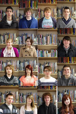
All of the volunteers couldn't have been more helpful, and I want to make clear that the abandoning of this idea is no fault of theirs. The problem is, it just doesn't look like a poster. Good posters jump out, grab your attention, and refuse to leave your mind until you walk into that cinema and purchase that ticket. What you see above is banal and bland; more effective as a sedative than a stimulant. Our quantitative audience research revealed that what audiences most looked for in a poster was an eye-catching image and images of the characters or actors. So, not only was this poster not performing its general role, it was not performing the specific roles required for it to appeal to our target audience.
Being entirely unhappy with this design (as you can probably tell), I went away thinking deeply about new possiblities and variations, keeping in mind the criteria set by our by our audience research results. I began to reconsider what it was that stood out to me most about our film. The predicament of the protagonist is definitely at the core of our film, but this is difficult to convey in a single poster, and besides, our target audience would be more interested in watching the film if they were yet to discover the nature of the protagonist's situation. Finally, it occurred to me: what gives the film its identity on first impression is the title - PENUMBRA (click here for an explanation).
So, last night, with the title of the film at the forefront of my mind, I began to construct an entirely new poster. I explained the idea over the phone to Tom, and from this he drew his own mock-ups of how the poster could look. The first two images below show the initial experiments carried out in photoshop yesterday evening, and the rest are all from different stage in the poster's production today. Below each image is an explanatory caption.
Because I have literally just completed this poster this afternoon, Tom has yet to see it, and I have yet to ask anyone besides my parents for feedback on it. Therefore, this is by no means our final poster. Before we reach that stage, I will look at the poster with Tom to see what variations we can create - perhaps of a different style, or perhaps in the same style for different modes of exhibition - and we will show the poster to a lot more people in order to get some detailed qualitative feedback.
Whilst Tom liked the plan including the actual yearbook, I kept pushing the first plan, because, not only was the grid of photos clearly going to be simpler, I believed it would be more effective; the faces staring directly out were going to catch people's eyes and draw their attention straight to our film. So, with this in mind, Tom and I used part of Tuesday's lesson to take volunteers into the library and photograph their head and shoulders against the quintessential school photo backdrop: a bookshelf. Pleased with the amount of photos we had taken, I went home, slipped the SD card into my laptop, and started editing away with photoshop.
I placed all of the photographs onto the canvas in order to get an idea of what the final poster was going to look like. That's when it dawned on me: THIS LOOKS REALLY AWFUL.

All of the volunteers couldn't have been more helpful, and I want to make clear that the abandoning of this idea is no fault of theirs. The problem is, it just doesn't look like a poster. Good posters jump out, grab your attention, and refuse to leave your mind until you walk into that cinema and purchase that ticket. What you see above is banal and bland; more effective as a sedative than a stimulant. Our quantitative audience research revealed that what audiences most looked for in a poster was an eye-catching image and images of the characters or actors. So, not only was this poster not performing its general role, it was not performing the specific roles required for it to appeal to our target audience.
Being entirely unhappy with this design (as you can probably tell), I went away thinking deeply about new possiblities and variations, keeping in mind the criteria set by our by our audience research results. I began to reconsider what it was that stood out to me most about our film. The predicament of the protagonist is definitely at the core of our film, but this is difficult to convey in a single poster, and besides, our target audience would be more interested in watching the film if they were yet to discover the nature of the protagonist's situation. Finally, it occurred to me: what gives the film its identity on first impression is the title - PENUMBRA (click here for an explanation).
So, last night, with the title of the film at the forefront of my mind, I began to construct an entirely new poster. I explained the idea over the phone to Tom, and from this he drew his own mock-ups of how the poster could look. The first two images below show the initial experiments carried out in photoshop yesterday evening, and the rest are all from different stage in the poster's production today. Below each image is an explanatory caption.
 |
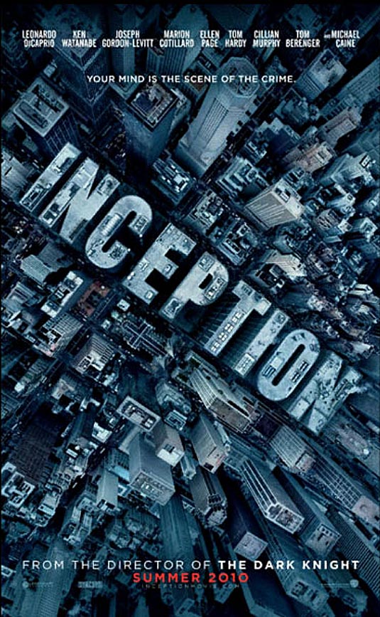
| Inspired by this poster for Inception, I put the title at an angle spanning most of the poster, and gave it the signature glow of our title (important because A- it looks cool, and B- it relates to the definition of penumbra as a part of a shadow). Then, using internet tutorials, I learned how to mask layers in such a way that images can appear within text. Our lead-actors eyes can be seen peering out from the forth stroke of the M. |
 |
| Here, I was trying to see if it was possible to have an image show through more than one piece of text. Luckily, this process wasn't as difficult as I had expected. |
 |
| This morning, in Media, the first thing I did was to create lots of text layers which i then transfromed and arranged to make an interesting collage. |
 |
| I then grouped the text layers appropriately, then rasterized them and merged them so that different images (either from our film or relating to it) can be seen in different peices of text. |
 |
| Deciding the images within the text were too busy with detailed colour, I made them all black and white, and this definitely had a positive effect in drawing more attention to the title. After discussing things with Tom, we decided it would be a good idea to have an outline of our protagonist in the bottom right-hand corner. I set about cutting a blurred image of our lead-actor out of a frame from our film, and once this was in the poster, both Tom and I agreed it looked better in full colour than as an outline alone. |
 |
| Next, in an attempt to make the poster stand out more, I experimented with different hues of different intensity for the images in the text. Eventually, I decided that red was most attention grabbing, and most fitting for the theme of pain which is important in our film. |
 |
| Finally, here (at full resolution, provided you click on the image) is our new poster! In this final stage, I increased the vibrancy and brightness of the colours in the image of our protagonist from the back, so that he is more visible against the solid black background. I also added some text (in the same font as the title for conguity) to specify that the poster is advertising a short film, and some other text to credit Tom and I as directors. (For the crediting font, I searched online to find fonts similar to those used for crediting in actual film posters, and then downloaded and installed one called 'Rothman' from this website) |
Saturday, 7 August 2010
Music Video Remake: Editing
It has to be said that, as a music video remake, the editing process was different in many ways. Instead of creating something new and original, where artistic decisions could be made at all stages, I was replicating a pre-existent product; working to a predetermined model. In some ways, this made the editing easier, because I didn't have to decide what shots to use where; I just had to have the footage ready, and cut the shots together as shown in the original video. In others, the process was constraining, because there wasn't much freedom to stray from the path that the original video dictated.
Intuitively, I took advantage of multiple video tracks, running the original video above my own footage so that I could time the cuts between shots as accurately as possible. Essentially, I was reviewing the original video, and aligning my own footage to it to create the remake. Whilst it wasn't difficult to time the cuts correctly, timing the pace of the performance to the audio track was much more of a trial-and-error procedure. To get the pace as accurate as possible, I began by watching the footage with the audio track and estimating the phase difference between the two. I then moved the starting position of the footage the appropriate amout to compensate. As it gradually became clear that the audio and video track were close to being in-phase, I moved the starting position back and forth in smaller and smaller increments, until the video and audio track worked together well.
 |
| The original shot. |
 |
| The new footage, imitating the original shot. |
Friday, 6 August 2010
Music Video Remake: Production
Soon after completing my animatic, I set to work persuading peers to take part in my surreal audio-visual venture. Luckily, a college 'day-off' was fast approaching, so I took the opportunity and organised filming to take place on that day. Ideally, I would have filmed the remake on the school stage, or in a drama studio, to ensure that the mise-en-scene was as similar as possible to that of the actual video. However, because availability of volunteers was limited to a day without college, and because I wanted a space that was mine to control (without definite time-windows and lingering responsibilities), I decided to film in my back garden.
After reviewing the placement of the band and the shots required, I chose an appropriate position for filming which had the least restrictions for both camera placement and on-screen action. It was also quite necessary that I filmed on one side of the garden to avoid capturing enormous changes in lighting throughout the day. Although this couldn't be avoided entirely because of sporadic cloud-cover, the position I chose did minimise the problem considerably.
I was aiming to film what I needed as quickly as possible so as not to waste the volunteers' time, so I used the planning skills I had developed during my AS Media production project. Essentially, I wanted to make sure that I filmed only what I needed, and filmed it well, so I transferred all of the illustrated frames from my animatic onto sheets of A3 paper in order of first appearance. I then wrote the time windows in which the shots are used beneath each frame. With a variety of static shots to recreate, this preparation enabled me to set up a shot, and then film all of the moments that it is used one after the other. This method not only saved time and effort in setting up shots, but ensured that each respective shot remained the same throughout the video.
Probably the biggest limitation I faced in remaking the video was in terms of accuracy was that of the props. The closest I could get to a real instrument was a small electric keyboard, so improvisation was required. Drumsticks became screwdrivers, guitars morphed into spades and tennis rackets, a metal safe became a cardboard box, chains turned to rope, and the miniature motorbike was swapped for a child's pedal bike. Still, this didn't matter too much, because the substitute props were chosen for their similarity in shape, proportion and utility to the real thing. As a result, the shots and performance were hardly affected.
To ensure that everyone was performing in time, I hooked up a laptop to some speakers nearby, and played the original music video whilst filming. This allowed the volunteers to pretend to play their 'instruments' at the correct pace, so that I could time it to the audio track during editing. Seeing as only I was familiar with the video and the song, it was necessary that I mimed the lyrics. In order to allow myself to set-up the shot and also be in it, I asked a volunteer of the same approximate height to pose as me in the shot as I aligned the camera. After pressing record and swapping places in the shot, the same volunteer then played the video on the laptop at a suitable point for the rest of us to mime along to. This was the process used throughout the day, but not for certain shots involving the sabotage of the safe/box, where the timing of the performance wasn't particularly important.
The solutions for the ascent and descent of the safe/box were very much ad hoc. Essentially, we used an extending pole provided by a volunteer to hold a rope which was tied to the box. This way, a volunteer could hold the box in position whilst the performance was being filmed, and when it came to dropping the box, the rope could be fed through the loop at the end of the pole, allowing the box to fall vertically. I placed some items in the box before sealing it up to ensure that the box actually would fall instead of blowing to the side in the wind (which is rather uncharacteristic of a safe).
Admittedly, there are some glaring errors in continuity both between the original video and the remake, and just within the remake. Some examples of the former are


Some examples of the latter are:


All in all, I found the production of the piece to be a very enjoyable and worthwhile experience, and I would like to thank Alex Branson, Daniel Knights, Toby Barrett, Tom Palmer and Martin Campbell for their extremely skillful 'pretend-play' performances and their invaluable assistance in the arts of button-pushing, knot-tying and rope-pulling.
After reviewing the placement of the band and the shots required, I chose an appropriate position for filming which had the least restrictions for both camera placement and on-screen action. It was also quite necessary that I filmed on one side of the garden to avoid capturing enormous changes in lighting throughout the day. Although this couldn't be avoided entirely because of sporadic cloud-cover, the position I chose did minimise the problem considerably.
I was aiming to film what I needed as quickly as possible so as not to waste the volunteers' time, so I used the planning skills I had developed during my AS Media production project. Essentially, I wanted to make sure that I filmed only what I needed, and filmed it well, so I transferred all of the illustrated frames from my animatic onto sheets of A3 paper in order of first appearance. I then wrote the time windows in which the shots are used beneath each frame. With a variety of static shots to recreate, this preparation enabled me to set up a shot, and then film all of the moments that it is used one after the other. This method not only saved time and effort in setting up shots, but ensured that each respective shot remained the same throughout the video.
Probably the biggest limitation I faced in remaking the video was in terms of accuracy was that of the props. The closest I could get to a real instrument was a small electric keyboard, so improvisation was required. Drumsticks became screwdrivers, guitars morphed into spades and tennis rackets, a metal safe became a cardboard box, chains turned to rope, and the miniature motorbike was swapped for a child's pedal bike. Still, this didn't matter too much, because the substitute props were chosen for their similarity in shape, proportion and utility to the real thing. As a result, the shots and performance were hardly affected.
To ensure that everyone was performing in time, I hooked up a laptop to some speakers nearby, and played the original music video whilst filming. This allowed the volunteers to pretend to play their 'instruments' at the correct pace, so that I could time it to the audio track during editing. Seeing as only I was familiar with the video and the song, it was necessary that I mimed the lyrics. In order to allow myself to set-up the shot and also be in it, I asked a volunteer of the same approximate height to pose as me in the shot as I aligned the camera. After pressing record and swapping places in the shot, the same volunteer then played the video on the laptop at a suitable point for the rest of us to mime along to. This was the process used throughout the day, but not for certain shots involving the sabotage of the safe/box, where the timing of the performance wasn't particularly important.
The solutions for the ascent and descent of the safe/box were very much ad hoc. Essentially, we used an extending pole provided by a volunteer to hold a rope which was tied to the box. This way, a volunteer could hold the box in position whilst the performance was being filmed, and when it came to dropping the box, the rope could be fed through the loop at the end of the pole, allowing the box to fall vertically. I placed some items in the box before sealing it up to ensure that the box actually would fall instead of blowing to the side in the wind (which is rather uncharacteristic of a safe).
Admittedly, there are some glaring errors in continuity both between the original video and the remake, and just within the remake. Some examples of the former are
- The guitarist is holding his guitar the wrong way. This was a simple mistake that went unnoticed for a while, and when it was noticed, I judged it not to be worth filming the affected sections again.


- The vocalist is often stood to the wrong side of the frame. This mistake was entirely of my own making, caused by a misinterpretation of what the camera was filming; in the shots where I was miming directly to the camera, I fully rotated the preview screen so that I could set-up the shot, and forgot to compensate for the fact that the preview adjusts to mirror the image it receives.


Some examples of the latter are:
- The pole holding the safe/box suspended changes sides. It was unavoidable that the pole would be captured within the frame, but I also failed to foresee a problem in where the volunteer holding the pole was standing, so the pole does change from being on the right to being on the left, and then back again.


- The blue coil of rope being tugged by the pedal bike fully unwinds, only for the following shot to show it unwinding once more. This problem was unavoidable, simply because I didn't have enough rope for the coil to continue unwinding as the bike moved further and further away.


All in all, I found the production of the piece to be a very enjoyable and worthwhile experience, and I would like to thank Alex Branson, Daniel Knights, Toby Barrett, Tom Palmer and Martin Campbell for their extremely skillful 'pretend-play' performances and their invaluable assistance in the arts of button-pushing, knot-tying and rope-pulling.
Subscribe to:
Posts (Atom)